Priceline
Account Dashboard Design
Priceline is an online travel agency with a mission to be the best travel dealmakers in the world. For this project, I spearheaded the design of a new profile dashboard page.
Our profile structure was limiting where and how we could include new features in a user’s profile. Further, the design was feeling dated and no longer aligned with our branding.
To allow for greater feature and function flexibility and to continue to modernize our design, I worked alongside a cross-functional team of PMs, developers, and researchers to design a new dashboard page for user profiles. We’ve created a cohesive structure that allows our profile to grow and adapt to user needs.
Role
Lead Product Design
Design Manager at Priceline
Skills Utilized
Competitor auditing
Creative design thinking
Cross-functional collaboration
User research and testing
Iterative UX and UI design for A/B testing
Project Highlight
91%
Win Probability
Dashboard Approach
After a round of competitor auditing and inspiration gathering, we determined the best approach to achieve our goal of flexibility and modernization was the create a profile landing page. This page replaces the “My Account” page and displays more succinct previews of each interior account page, as well as preview cards for each profile page (Trips, Wallet, VIP).

Dashboard Account Flow
When a user clicks into an interior account page (here, the Communications Preferences page), a familiar sub-navigation of all interior pages displays, as well as an easy to find back button.
Mobile Display
The dashboard page was designed with a mobile-first approach, as we wanted this page to be highly responsive and adaptable.
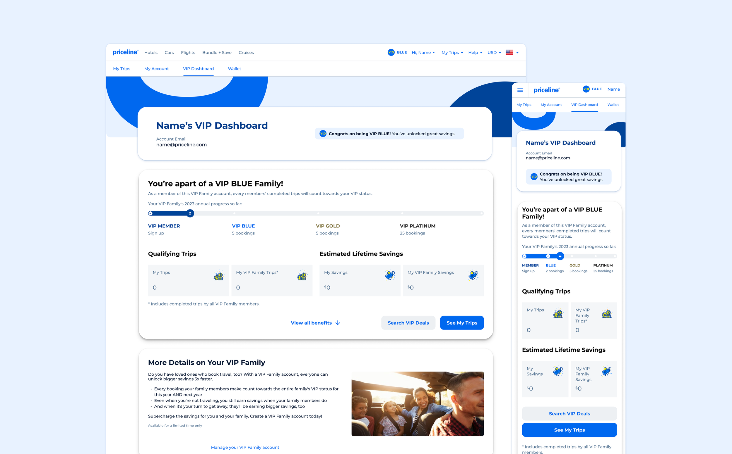
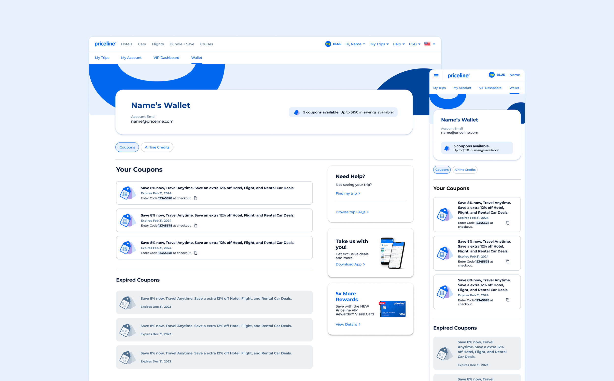
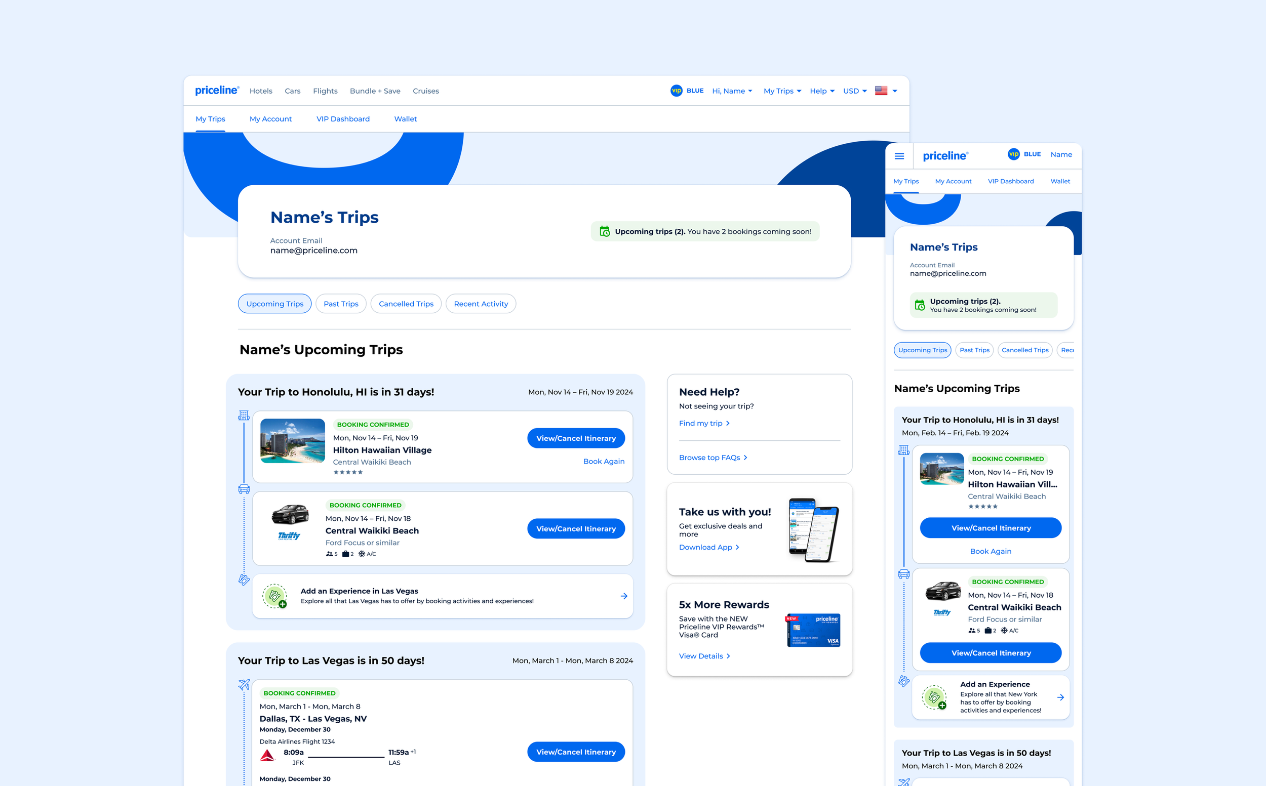
Trips, Wallet, and VIP Pages
We maintained the structure of each profile page, ensuring that they remain familiar and easy to navigate for users. A unifying header was brought in to create a cohesive experience and signal to users they are in their profile section when visiting each page.
Header Component
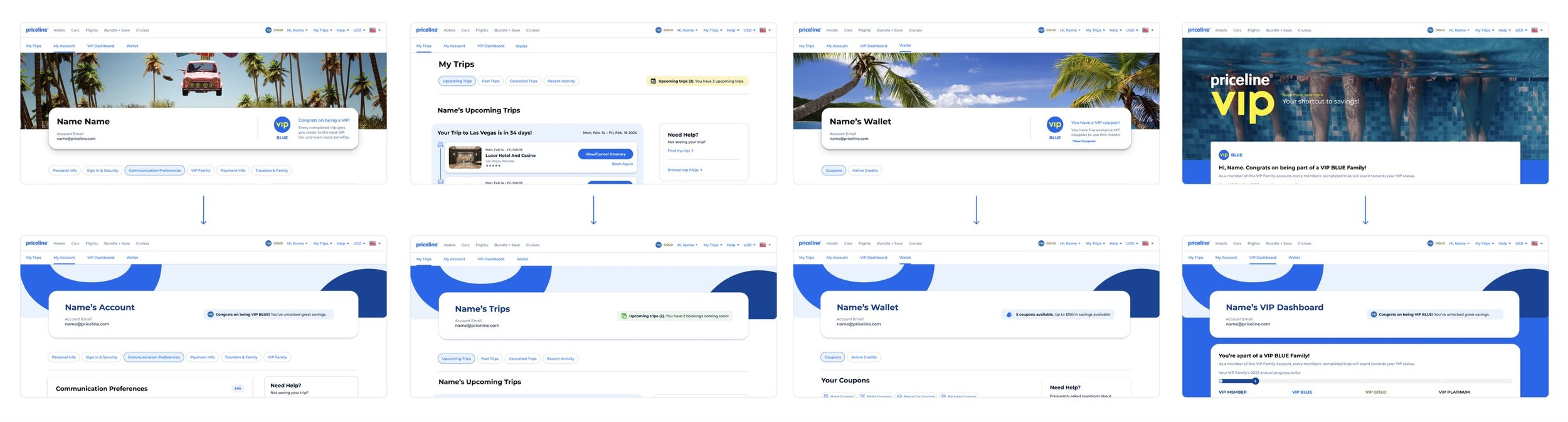
Previously, each profile page had a different header– now, there is a cohesive and unified header display across all profile pages. The header contains a background image, page title, user email address, and small banner related to the page content.
User Testing
To validate the design direction, we ran two rounds of user testing focused on the usability of the existing profile experience vs. our proposed dashboard experience. The user testing findings overwhelmingly supported the proposed dashboard approach.
-
"It's easy to glance [at the page] and see where I want to go. I give this a 5/5, it was really easy to navigate."
– User testing participant, viewing the desktop dashboard experience

-
"I see my VIP status and that coupons are available to me... I see that I'm a valued customer at this company right away."
– User testing participant, viewing the mobile dashboard experience

-
"I think travel is exciting and I like seeing that excitement translated into the page design like this."
– User testing participant, viewing the mobile dashboard experience

What’s Next…
In future iterations, we hope to test removing the top-of-page sub-navigation, making the dashboard the central hub of navigation. We also are looking to test further enhancements to add even more user delight, like adding a profile picture and allowing users to customize the background image of the header block.
Measuring Success
91%
Win Probability
+26
Net Incremental Bookers per Day
+54
Net Incremental Bookings per Day
+$4,131
Net Incremental Contribution per Day